5 years providing services to us, our pupil, Joygame brand and website, as you know, the time changed continuously as shell, tried to keep pace with the time and trends, user is easier to use, the user was a freer environment for. Sometimes, our new launches the first announced location, sometimes the old mausoleum of all our stops was the location. Sister brand never tried to raise the Fed doesn’t upset them all.
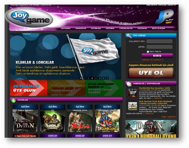
The color purple dominated the first toward the end of September 2009, Joygame was opened. Only 4 game-opening on our first Joygame’s many of you the first time you may see.
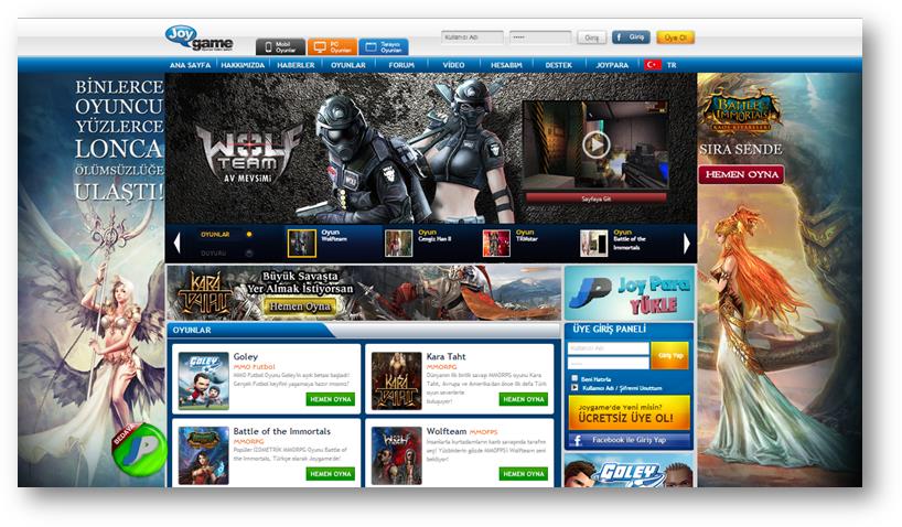
With years of us living on this portal and then changed and made the transition from purple to blue shells. A little more modern, it was a little more restrained.
Recent innovations in today’s Joygame appeared on our site. The site is fairly simple and plain, but it was handy. A new generation of games and entertainment (see I added the word fun.) in the name of the first step in creating the portal “Joygame Version 2.5” were imbued with this site that we call.
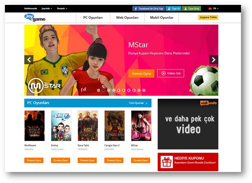
By the way, there was a small detail that attracts our attention alone; Portal sadeleşti, flat design, but pudgy speech bubble logo on the Hill sırıttıkça grinned.
Creative health teams noticed it immediately extinguished the balloon with a needle, dark blue, turquoise, taking water turned the color. It became a fashionable, our new website.
All of these studies so JG Version 2.5 ‘ s 2.6 s, actually Joygame V3 was the preliminary studies. We’re not doing the countdown to V3 yet, still more needs to be worked hard on it, but when we all so I have no doubt that you enjoy gaming and entertainment portal.
We consider ourselves not only a gaming portal “digital entertainment and gaming platform” we, or rather the position as I cried out in clear language what we have so far is because of 2014 will no longer have decided to change our logo. Our old logo bad? No, I think it’s very beautiful, but we are trying to have a great concept precisely reflect we’ve noticed. We actually just a color, so it’s not just blue purple or all the colors we set out, including digital representative.
That’s why we turned our faces painted, evirdik, jöleledik, poured, we scanned, we broke, we’ve done it, and. ..
We have created our new logo suits us.
You are also now Portal and logo, you will see new faces everywhere we use. Beğenenin also, beğenmeyenin also, he looks like this, never, perfect, Wow, come on, just because of the pilgrims have been hurt to get it right. Is separate from the colors of ideas…
Thank you,
Ozan Aydemir
SHR Group Marketing Director
Love and best regards to …

